by Roveel | Reporting solution for Sage 200
How to Quickly Present Sage 200 Data with Clear, Visual Dashboards
Working with Sage 200 data often means dealing with large volumes of financial and operational information like sales, stock, cash flow, credit control, and profit and loss reports. The challenge isn’t access to this information within Sage 200. It’s turning it into something people can understand quickly and act on. That’s where graphical dashboards make a major difference.
Instead of relying on spreadsheets or static reports, modern dashboard tools transform Sage 200 data into visual charts that let users scan performance instantly. Humans process visual information significantly faster than tables of numbers, which means trends, risks, and opportunities become visible at a glance rather than buried in rows of data.
Why graphical dashboards for Sage 200 are more effective than spreadsheets
Spreadsheets are flexible, but they are not designed for fast decision-making. Users often spend time filtering, sorting, and manually interpreting figures before they can understand what is happening in the business.
By contrast, dashboards convert the same data into:
-
Trend lines for sales and revenue movement
-
Pie or bar charts for cost breakdowns
-
Visual cash flow summaries
-
Credit control ageing charts
-
Profit and loss snapshots
This shifts the perception from “reading numbers” to “seeing patterns” which significantly reduces cognitive load. Instead of analysing line by line, users can visually scan for changes, spikes, or risks immediately.
Turning Sage 200 data into instant insight
The key advantage of integrating Sage 200 with a dashboard system is speed. Once data is extracted and structured correctly, it can be refreshed automatically and displayed in real time.
This removes several common bottlenecks:
-
Manual report building in Excel
-
Repetitive formatting and reconciliation
-
Delays in sharing information across teams
-
Risk of outdated or inconsistent reports
With a well-designed dashboard, decision-makers can view live business performance without waiting for monthly reporting cycles.
Making business data easier to understand across teams
One of the biggest benefits of visual reporting is accessibility. Not every user in a business is a finance expert, but everyone still needs to understand performance.
Dashboards allow different teams to focus on what matters to them:
-
Sales teams can track revenue performance
-
Credit control teams can instantly see overdue accounts
-
Operations teams can monitor costs and supplier spend
-
Management can view overall profitability and cash position
Because the information is visual, it becomes easier to interpret without specialist training.
Faster reporting with Sage 200 dashboard solutions
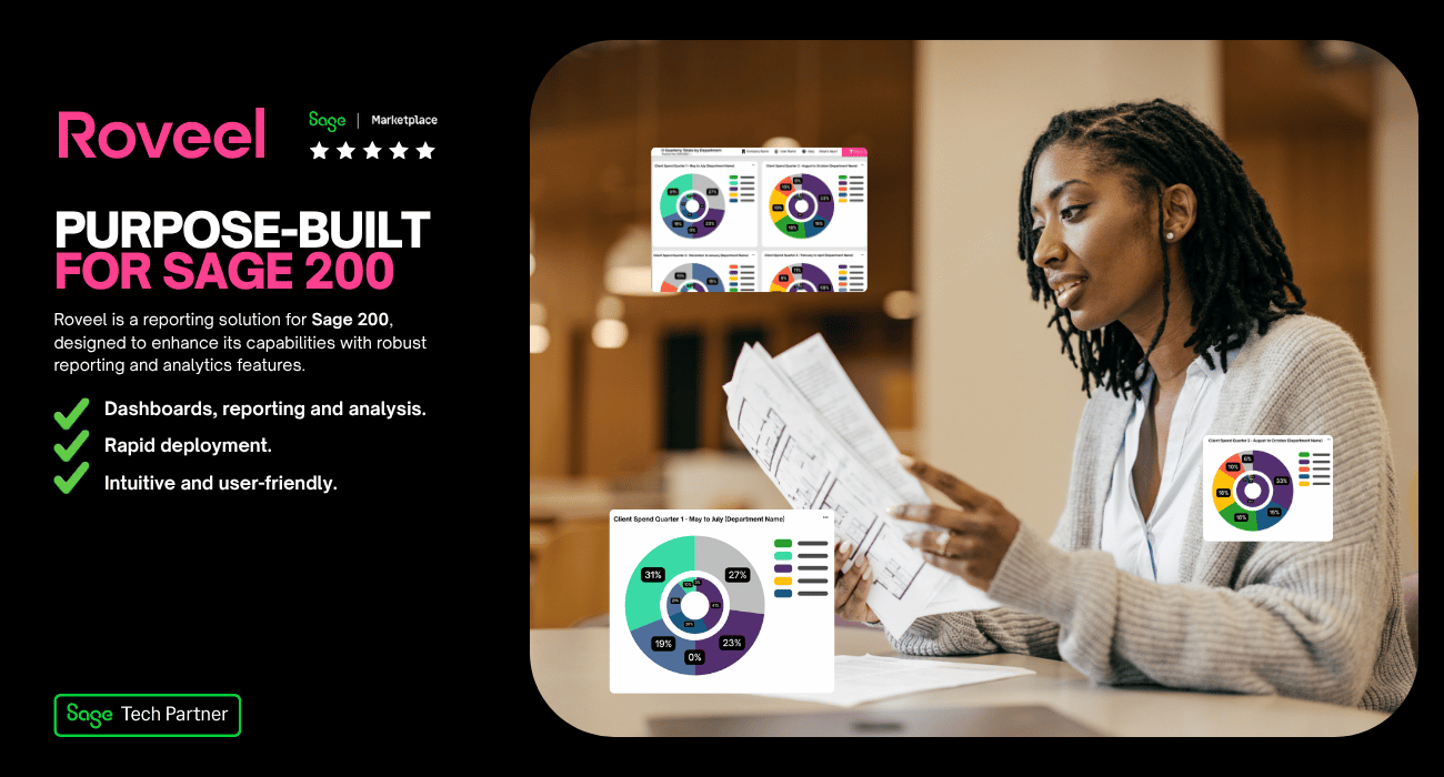
Tools designed specifically for Sage 200 reporting can significantly reduce the time it takes to generate insight. One example is Roveel, which provides pre-built and custom dashboards that pull data directly from Sage systems.
Instead of building reports manually, users can access ready-made dashboards covering areas such as sales, profit and loss, cash flow, and credit control. These dashboards are designed to present key metrics visually, helping teams understand performance in seconds rather than hours.
For businesses with specific needs, custom dashboards can also be created so that the most important KPIs are always visible in the right format.
The real value: faster decisions, less effort
The main benefit of moving Sage 200 data into graphical dashboards isn’t just convenience, but also speed of understanding. When data is visualised effectively:
-
Problems are identified earlier
-
Trends are easier to spot
-
Teams spend less time preparing reports
-
Decisions are made with more confidence
In short, dashboards turn raw data into something actionable.
If Sage 200 reporting feels slow, manual, or hard to interpret, the solution is better visualisation. Graphical dashboards make data easier to scan, faster to understand, and simpler to share across a business. When information is presented visually, teams don’t just see the numbers, they understand what they mean.